Research and advocacy of progressive and pragmatic policy ideas.
Is Your Area A Transit Oasis Or A Transit Desert?
Where are people transit-deprived and where are they transit-rich? Using Shah Alam as a case study, we show the distribution of transit deserts and transit oases there, with an extra layer of property prices.
By Aziff Azuddin & Nelleita Omar28 July 2020
Malaysia’s investment into public transportation, particularly the MRT network, has significantly improved transit coverage for thousands of urban dwellers. And although ridership is now slightly lower due to lingering pandemic fears, usage will gradually increase if we continue to keep the number of COVID-19 active cases under control.
While MRT investments are a positive development, it is not a complete solution towards ensuring public transit coverage. Our research pieces published last year highlighted a range of more ordinary gaps in transit coverage such as the lack of bus routes, neighbourhood bus stops and safe walkways. Many areas are effectively ‘transit deserts’ due to these mundane yet critical reasons – especially low-income areas where the need for affordable and efficient public transportation is highest.
Read the research piece that kick-started our work in public transportation and our call for open data to improve public transportation. Our follow-up fieldwork series can be accessed here: Setiawangsa, Kota Kemuning, Smart Selangor, Klang to KL by KTM Komuter, and Klang.
Improving public transportation and transforming more areas into ‘transit oases’ would be greatly facilitated if the gap between supply and demand was made more transparent. As an initial step in this direction, we’ve designed a pilot transit density map for the benefit of commuters, policymakers and planners alike.
For this mini-study, we focused on the central Shah Alam township, one of the country’s first planned townships and a mature area comprising well developed residential, commercial and public institutions areas.
A key feature of our pilot transit density map is the visualisation of public transport coverage together with the area’s average income, as represented by median property prices. The combination of public transport coverage with property prices is vital to quickly show gaps in service coverage particularly for lower-income urban dwellers.
About the study
Not interested in how the map was constructed? Skip ahead to the next section.
Our study to construct a transit density map for central Shah Alam saw us gathering, constructing, combining and mapping out three different data sets.
The first data set comprises Geographic Information Systems (GIS) data of bus stops as buses are the main mode of public transportation in the township. Bus services are provided by RapidKL and the Selangor state government. Two KTM Komuter stations are also included in this data.
The next key component is the integration of Shah Alam City Council’s (MBSA) land-use data of central Shah Alam. Land-use data indicates whether plots of land are residential, commercial, industrial, recreational or institutional in nature. These are important to indicate population or traffic density and the potential demand for public transportation.
Next, we compiled, calculated and integrated data on the median residential property prices in the township (Section 1 to Section 24), based on property transaction data from 2008 onwards. Ideally, detailed income data from the official census should be used but due to constraints in acquiring this level of data granularity (more on this later), we have taken residential property prices as a reasonable proxy for income and wealth levels. Residential properties include both landed and high-rise units.
Using GIS, these three different data components were developed and combined into one map for spatial visualisation and analysis.
Finally, the transit density of an area within the map was determined by analysing the area’s walkability or distance to the nearest transit stop*. Residential, commercial, recreational and institutional areas that had a high concentration of ‘walkable’ transit stops, i.e. within 400m to the nearest stop(s), are deemed to be well covered. Residential, commercial, recreational and institutional areas that were more than 400m away from the nearest stop(s) were considered to be underserved.
*The definition of transit density in this pilot study is based on a mainly spatial approach; it does not incorporate actual population data due to constraints. A more precise representation of the gap between demand and supply of public transportation would require the incorporation of detailed population density data, which we hope to pursue in future with data from Census 2020.
How to read and use the map
The landing page of the transit density map shows the default view of central Shah Alam township. Zoom in or out using the ‘+’ or ‘-’ button. Press the ‘home’ button to go back to the default view.
The coloured land plots indicate residential, commercial and other types of areas. Click the top right-hand side button for the land-use legend.
The ‘bus’ button on the right-hand side is the transit density button which allows you to filter areas by transit density. There are two views: by density grid or by radius from the nearest stop.
The ‘house’ button on the right-hand side is the residential property price button which allows you to filter areas by median property price ranges.
If you find this transit density map interesting or useful, please use the share icon to share or embed the map. If you do choose to embed, we kindly request that you credit The Centre.
Shah Alam Transit Density Map (Pilot)
What does the map tell us about Shah Alam’s transit coverage?
By interacting with this map, a commuter or planner could easily see differences in transit density and coverage across areas of potentially high demand, such as residential areas with lower incomes (represented by lower median property prices). Pairing the transit density map with local knowledge gives potential ways to turn ‘transit deserts’ into ‘transit oases’. The following are some examples:
Transit oases: Shah Alam’s busy commercial centres

Seksyen 7 is located behind Universiti Teknologi MARA’s (UiTM) main campus and Universiti Selangor (Unisel). There are seven bus routes serving Seksyen 7, covering a majority of the neighbourhood’s key areas. The area is popular with students making it the right type of neighbourhood to run a variety of bus routes in order to connect students to their residences, universities, commercial and public facilities and the wider township.
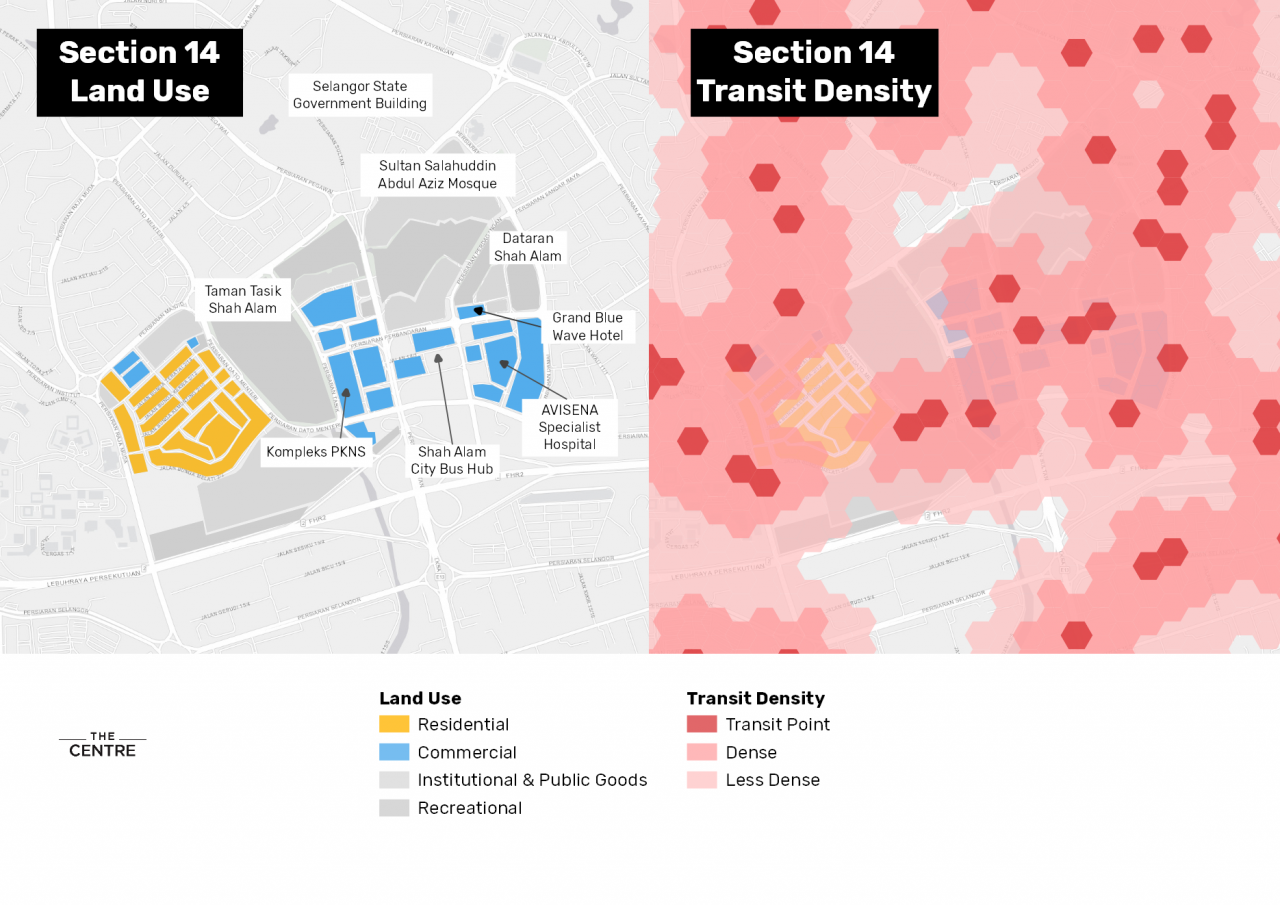
Another busy centre, Seksyen 14, is located at the heart of the township close to the Selangor state’s administrative centre. The PKNS Complex, the city’s first shopping mall, is here and serves as Shah Alam’s symbolic commercial centre. As a central location for the township, it makes sense for the city’s bus hub to be located here, with nine bus routes connecting the city centre to a broader network within and beyond Shah Alam.
Since transit coverage is already quite dense in these areas, improvement efforts would be quite targeted for example placement of additional bus stops or adding service frequency amongst others.
Pockets of transit deserts
Several locations throughout the township can be considered transit deserts i.e. residential or commercial areas with few or no bus routes. However, the underlying reasons for being a transit desert varies from area to area.
‘Village’ neighbourhoods with small road access
Kampung Padang Jawa in Seksyen 16 and Seksyen 17 is served mainly by narrow single-lane roads, allowing access only to small vehicles such as motorcycles, cars, and vans. A 2013 mobility study showed that residents in Kampung Padang Jawa prefer to travel by motorcycle, likely due to the neighbourhood’s narrow and winding roads.
Narrow road networks like those in Kampung Padang Jawa cannot accommodate the use of large public transport vehicles like buses. Could there be an opportunity to develop a micro-mobility solution to serve the area and other communities like Kampung Padang Jawa, such as mini-buses or feeder vans?
Kampung Padang Jawa is characterised by its network of narrow-roads.
Gated communities
At first glance Seksyen 13 looks like a transit desert but being a gated community, this may be due to low demand for public transportation from residents in these neighbourhoods. Residents in higher-income gated communities are more likely to use private vehicles to commute, making such areas a lower priority for service coverage.
A Bangalore study showed access to public transit was of low priority for those who wanted to purchase properties in gated communities.
Entrance to Sultan Abdul Aziz Shah Golf & Country Club, Section 13.
‘Needs further study’ neighbourhoods
On the other hand, there are areas such as Section 7, 8 and 9 where the neighbourhoods are not gated, appear accessible to public transport vehicles, and yet still lack transit stops. Unlike Kampung Padang Jawa, the roads are large enough to accommodate a feeder bus. As indicated in the image below, there are areas within these sections which are lower-income (i.e. low median property prices), which would imply a demand for more cost-effective transportation. More local information would be needed to offer an explanation – we invite local residents to give us their views.
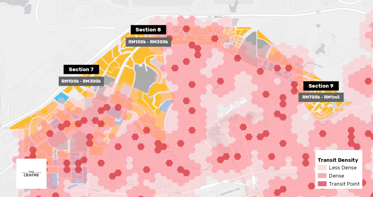

Neighbourhoods such as Section 9, 8 and 7 have accessible roads but do not have any transit points.
Transit density mapping as community engagement tool
While our pilot transit density map does not as yet incorporate service reliability or route adequacy, it does allow commuters to identify transit deserts in their respective townships and advocate for access and coverage. While this data is likely available to transport planners and service providers, it should be made available to the public who are at the receiving end of planning and policy decisions. When combined with other types of data such as population density, property price or income, it becomes an even more useful tool by which to prioritise public transport coverage.
The Malaysian government will be undertaking a nationwide census starting this month (July 2020). The data would be instrumental in preparing national development plans including for transportation planning. While the government and transportation service providers have recently made positive developments in data-sharing, we believe there is still more room for improvement and we advocate making census micro-data open for public use.
The holistic analysis of different types of data in transport planning, such as census, land-use and property price data would allow for more efficient transport planning. This transit coverage map presents one of the many ways we can utilise such data and contribute towards democratising transport planning and improving mobility.
While this study is limited to central Shah Alam, we see great potential in this transit density map being replicated and improved across city centres throughout Malaysia. If you are interested in expanding this project, we would be happy to discuss partnering opportunities. Drop us a line at aziff@centre.my.
Credits
This study was greatly informed by Universiti Tenaga Nasional’s (UNITEN) assessment on the local bus service in Kajang and a transit coverage study by the University of Texas at Austin.
Related Articles

Set Public Transportation Data Free
Make real-time public transport information public, free and useable.

What Is The Plan For Public Transportation In A COVID-19 World?
While the MY30 public transportation pass is commendable, we ask what are the policy commitments for getting public transportation back on track in the new normal.
")
The Financing Of RapidKL Bus Services Needs A Major Rethink
Lower ridership during CMCO has led to bus route cuts in the Klang Valley. Can the current funding model keep buses running and prioritise the interests of the public? We argue for a fundamental review.
The Centre is a centrist think tank driven by research and advocacy of progressive and pragmatic policy ideas. We are a not-for-profit and a mostly remote working organisation.